Revamping Tradition:
De Hawker’s Vibrant New Brand Identity
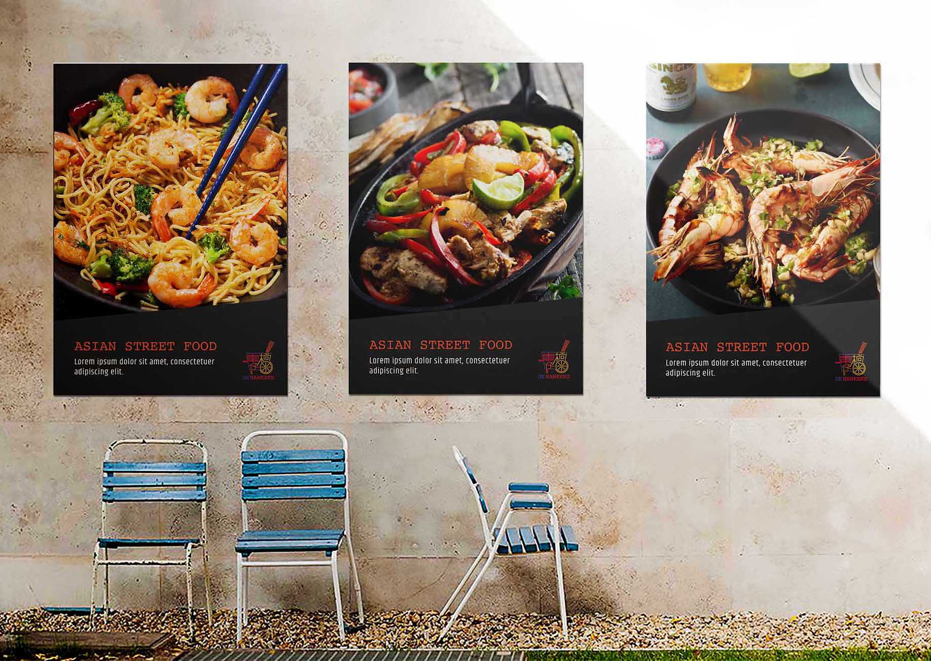
The De Hawker’s brand is inspired by the traditional style of Asian hawker restaurants, known for their lively and vibrant street-side food stalls offering diverse dishes from across Asia. Our goal was to capture this dynamic atmosphere and bring it into a restaurant setting.
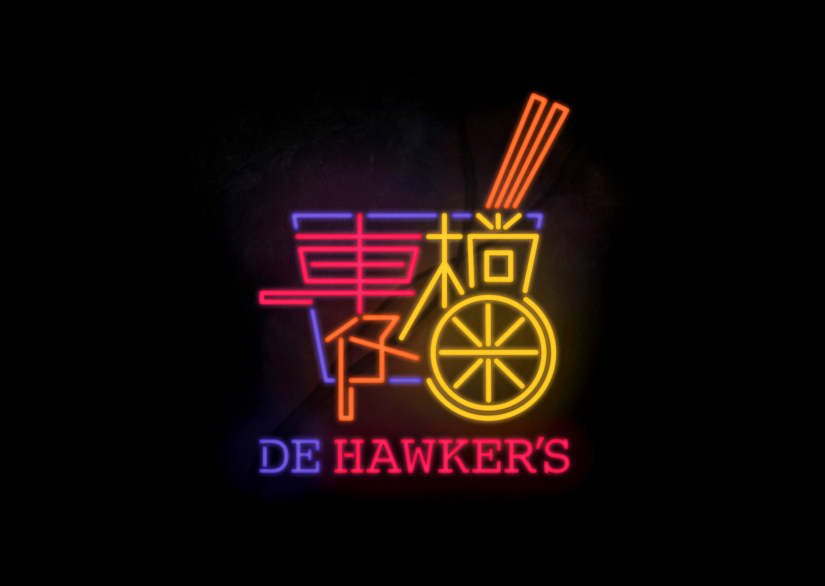
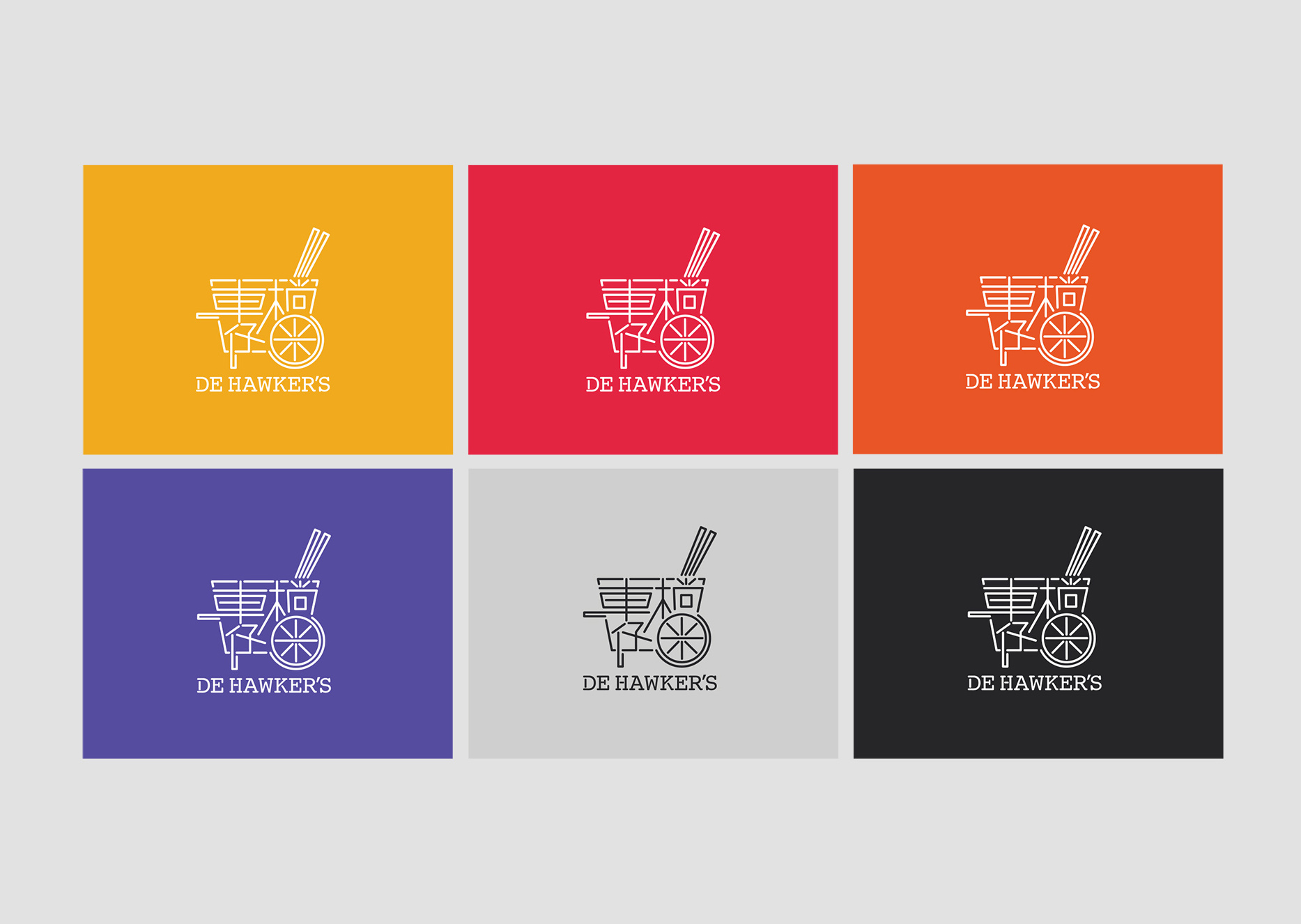
The centrepiece of De Hawker’s branding is a logo inspired by traditional hawker carts, embodying the bustling and vibrant nature of these street food stalls. The logo features classic neon lights, reminiscent of signage found in hawker districts, evoking a sense of nostalgia and familiarity. Additional Asian design elements, such as Chinese characters and chopsticks, emphasise the restaurant’s dedication to authentic Asian cuisine.
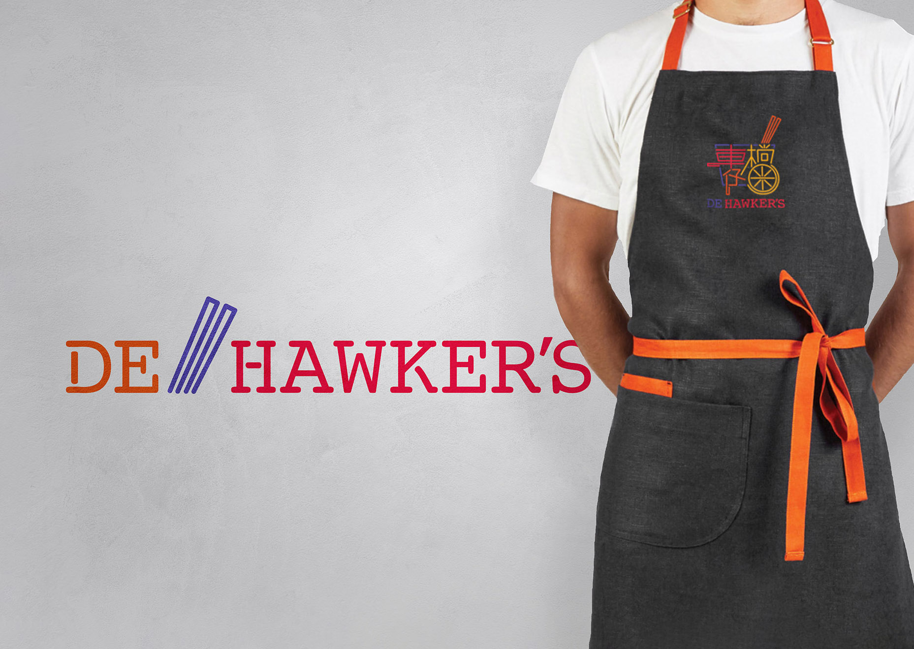
To create a cohesive and memorable brand identity for De Hawker’s, we focused on four key attributes: welcoming, passionate, retro, and fun. These guiding principles informed every aspect of the brand’s visual identity. We designed custom neon signage, packaging, and uniforms that aligned with the brand’s core elements, ensuring a consistent and engaging experience for customers.
Rebranding De Hawker’s presented the challenge of refreshing the visual identity while preserving essential elements from the existing brand. Extensive market research, including surveys and customer feedback, guided our creative process. We developed and tested several brand concepts, refining them based on customer reactions. The final branding successfully merges retro-inspired fun with a passionate commitment to Asian cuisine, creating a distinctive and memorable presence in a competitive market.